
Coldfront Icon
Initial Sketches
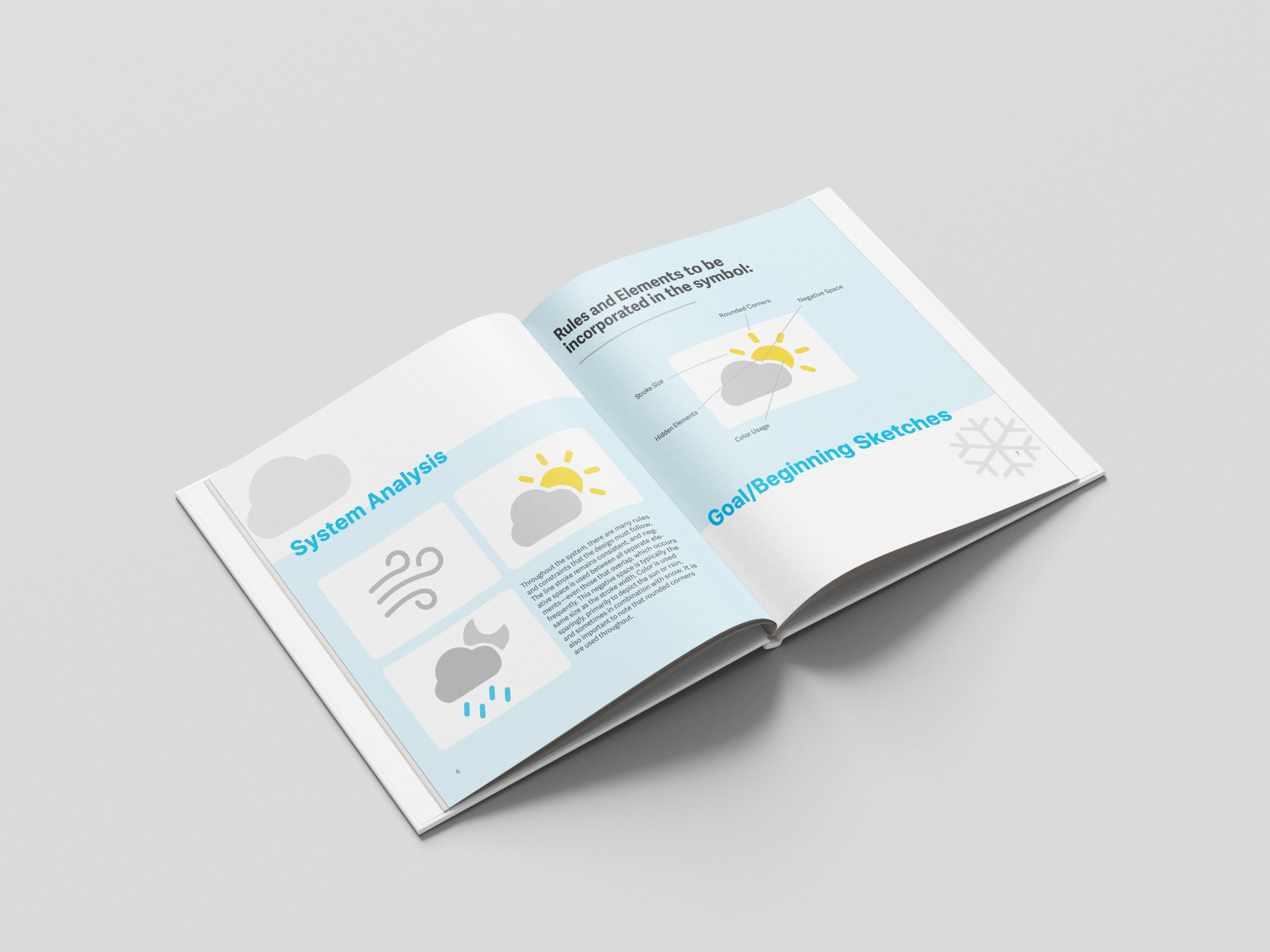
The cold front weather icon development began with exploring different ways to visually communicate a sudden change in weather. I focused on translating the characteristics of a cold front into a simple, recognizable symbol inspired by Apple’s clean and minimal design language.
Design Exploration & Comps
I experimented with different icon variations, refining shapes, proportions, and details to create a cohesive visual direction. I explored how to simplify weather-related imagery while maintaining clarity, consistency, and the recognizable aesthetic of Apple’s interface.
Final Designs
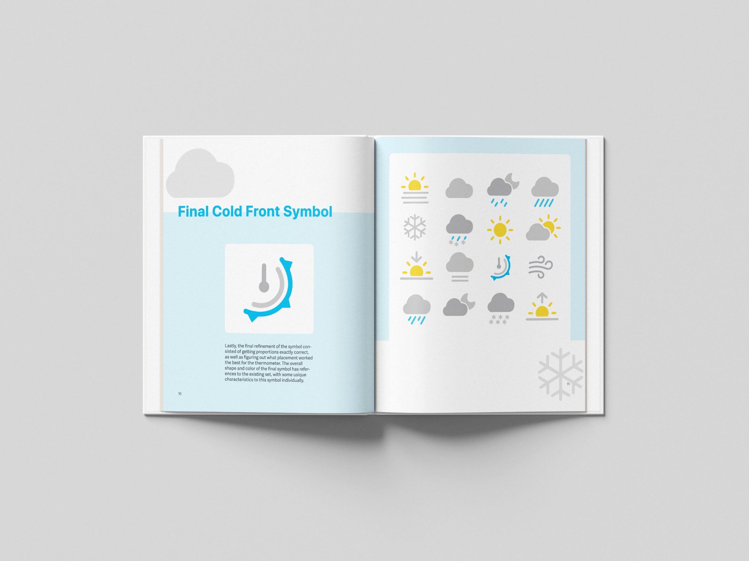
The final design translates the concept of a cold front into a clean, simplified weather icon. Using intentional shapes, balanced proportions, and minimal details, the icon reflects Apple’s approach to intuitive visual communication while remaining easily recognizable at different sizes.
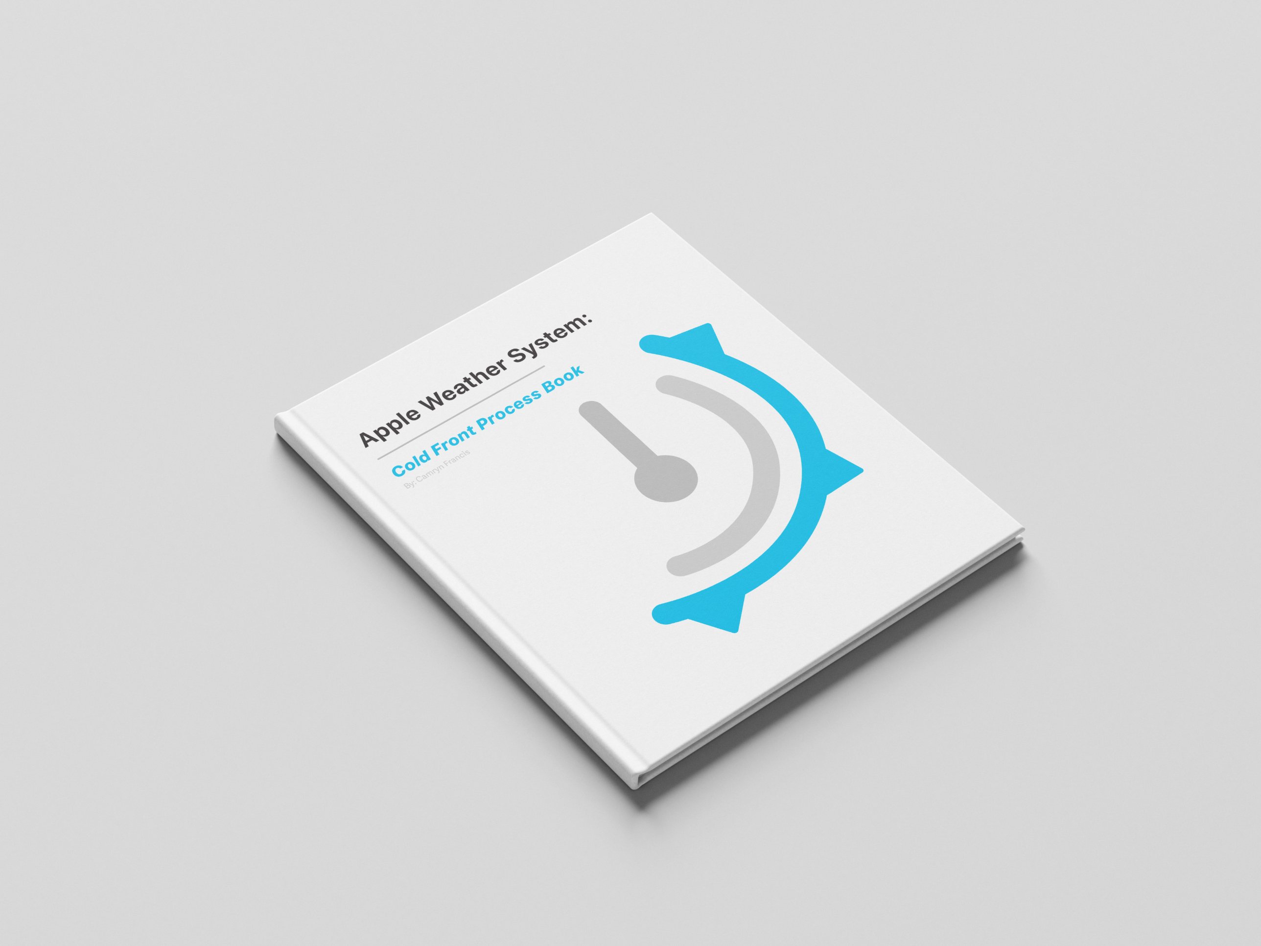
Class Project Process Book